Procedurally Generated SVG Landscapes
December 01, 2019
After a long haitus from coding, I took this Thanksgiving weekend to finally publish something to kwa.ng, a domain I bought years ago to be the eventual home of my future blog. I needed both a first post as well as a header for the site — hence, I decided to play with SVGs and write about it.
Landscape art felt like a particularly approachable kind of project to start with. First, landscapes can be really diverse and easy to generate. I wanted header art that could look distinct for every page, and there are many simple procedural methods to produce great-looking, varied terrains. Second, landscapes are easy to draw using just 2 things that the web supports really well: vectors and gradients.
Inspiration
Checking out some reference material on Google, I found that artists were generating some great looking scenes with a few common patterns. Here are a couple I drew inspiration from:
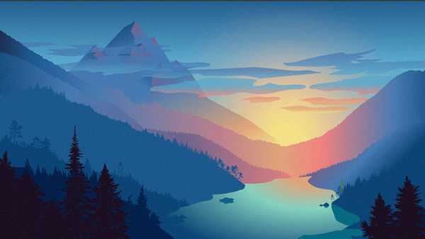
My favorite was this piece called “Confidence Gap” by Adam Eastburn:
All of these examples involved layering curved vectors for terrain, added lighting through gradient fills and then some detail / atmosphere. I particularly liked Adam’s “sunset” scene, because of the beautiful color blending, layer contrast and detail work (i.e. trees, suble film grain) which I tried to recreate.
Rendering the Terrain
Using SVG Path Elements to render the terrain was a no-brainer due to the vector art style and the free responsive scaling. To determine the height values, I first considered a gradient noise function like Perlin Noise or Simplex Noise, which are generally the gold standard in terrain rendering. However, I wanted a bit more predictability when generating and manipulating layers in case I wanted to do things like align the “valleys” of the terrain like in Adam’s sunset scene.
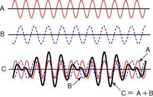
Therefore, I opted to use some old-fashioned trig functions, which are smooth and easy to manipulate:
Math.sin(proximityOfPeaks * (i + moveLeftRight)) * heightOfCurve)By interfering (adding) multiple waves of different frequencies, you can get a nice varied look:
To render these waves, I opted to just draw lines on my <path> element and sample the function by the window width. I chose this over drawing large curves in order to give me more control over detail work later:
Layering
When layered, each wave should change in shape and fill in order to build a sense of depth in the scene. I followed a couple patterns to get the right look:
- Each subsequent wave should be rendered lower and staggered (by adjusting phase) from the last
- Initial waves should be taller (higher amplitude) and wider (lower frequency) so they peek above the waves in the foreground (mountains in the distance)
- Waves should start unsaturated, as to appear washed out by light, and become darker and more saturated as they get further from the light source
- Randonmess should be mixed with most properties to get as much variation as possible
Using Color, it’s super easy to adjust properties saturation and darkness as you iteratively generate layers:
Lighting & Detailing
Now for the fun part. The first step is to choose a color scheme for lighting effects. My favorite tool for designing color schemes is Paletton.
The color scheme you choose dictates how many degrees you will be rotating around the color wheel to produce your accents and gradient stop fills. I’ve been able to get decent results with a complementary scheme (180 degrees), but I chose a triatic scheme (120 degrees) to mellow-out my accents and color transitions.
From here, you can get creative, but I’ll walk through 4 major effects I wanted to acheive. I originally wrote this in React, so the inline code blocks will read as such, but you should have no trouble decoding the markup:
Sky
The sky is just a rectangle with a gradient fill and a circle drawn somewhere for the sun. The key to the gradient fill comes from front-loading the stops to give the halo lighting effect around the sun’s position as well as desaturating it to boost the color contrast with the terrain:
<radialGradient id={`fillBg`} cx={sunX} cy={10}>
    <stop offset="0" stop-color={baseColor.rotate(120).desaturate(1).lighten(1).string()} />
    <stop offset="5%" stop-color={baseColor.rotate(120).lighten(.7).string()} />
    <stop offset="20%" stop-color={baseColor.rotate(60).desaturate(.5).lighten(.4).string()} />
    <stop offset="60%" stop-color={baseColor.rotate(0).desaturate(.5).lighten(.2).string()} />
    <stop offset="90%" stop-color={baseColor.rotate(0).desaturate(.5).darken(.1).string()} />
    <stop offset="100%" stop-color={baseColor.rotate(0).desaturate(.5).darken(.2).string()} />
</radialGradient>
I also added a noise filter which gives the sky a grainy, “indie” look:
<filter id="noise">
    <feTurbulence type="fractalNoise" baseFrequency="30" result="noisy" />
    <feColorMatrix type="saturate" values="0"/>
    <feBlend in="SourceGraphic" in2="noisy" mode="multiply" />
</filter>
Gradient Lighting
I used radial gradient fills on all my layers to light them, anchored at my sun’s position in the sky. All these gradient fills work off relative units, so you have to account for the distance between the layers in your anchor position.
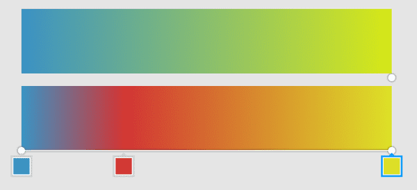
I started my accent color (present in the sun and sky) and blended it into my base color, preserving the darkening and saturating effects in the final stop. But without some sort of color in-between, it looked yucky. I added a color that was midway between my base and accent color, and introducing it at a 20% offset which helped give a real nice “sunset” palette:
After hacking around a bit more, here’s what I ended up with that looks pretty good for any base color:
<radialGradient id={`fill${layer}`} cx={sunX} cy={(sunY / 2) - ((layer - 1) / Math.pow(layers, 2))}>
    <stop offset="0%" stop-color={baseColor.rotate(120).saturate(.3).lighten(.3).desaturate(.1*layer).darken(.1*layer).string()} />
    <stop offset={`${(20 / layer)}%`} stop-color={baseColor.saturate(.3).desaturate((layer / layers) / 4).darken((layer / layers) / 2).rotate(120 - (45 * (layer / layers))).string()} />
    <stop offset="100%" stop-color={baseColor.saturate((layer / layers) / 2.5).darken((layer / layers)).string()} />
</radialGradient>
Trees
I added trees by texturizing the waves with some high frequency interference waves. To make the foreground more distinct and the background smoother, I used a log function on the amplitude modulated by the layer count. With some tweaks, my terrain function ended up looking like this:
(Math.sin(freq1*(i + phase1)) * amplitude) + // base
(Math.sin(freq2*(i + phase2)) * amplitude / 2) +
(Math.sin(i * layer / 5) * Math.log(layer) / 4) + // trees
(Math.sin(i * layer / 3) * Math.log(layer * 2, 10) / 2) +
(Math.sin(i * layer / 2) * (Math.log(layer, 2) * 1.5)) +
Fog
I used a rectangular white gradient of varying opacity to add a misty look and boost contrast between layers / text overlay readability. At first I set the opacity to randomk, and it worked great for atmosphere, but I noticed it doubled as well for ambient illumination. In my example below, I’ve tied it to the Y position of the sun to give a “time of day” feel.
<linearGradient id="fog" x1="0%" y1="0%" x2="0%" y2="100%">
    <stop offset="0%" stop-color="rgb(255,255,255)" stop-opacity={(1 - (sunY * 2))} />
    <stop offset="100%" stop-color="rgb(255,255,255)" stop-opacity="0" />
</linearGradient>
Here’s a completed example and codebase:
More Juice
The thing I love about generative art like this is how much control you now have over the iteractivity of the site and the way you can blend it in with the content of the page. If I had a few more than hours, there’s a ton of rabbit holes I’d love to expand upon this to boost the detail and interactivity of the scene. Some ideas on where to take it from here:
- A live day / night cycle, perhaps anchored to scroll position or time of day
- More variety on scenes and challenging detail (weather, water / snow, hi-fi trees in the foreground, sky artifacts like clouds / birds)
- Parallax scroll on layers
- Fun artifacts on terrain like structures or people on select peaks
- Jagged mountains in background layers
- Seeding the scene with the page title for consistency
- Sticky subnav to pop into the header once it scrolls beneath the page fold
- …
One point to note, I would definately recommend using a noise function for detail work. Trig functions aren’t a great fit for detail work since high-frequency waves cycle very often - leading to bland, tiled-looking textures. Instead, smooth noise functions can provide much better randomness when texturing the curve. You can also vary the increments of your terrain function to get a more “jagged” look.
The code in these examples need a bit of cleaning up and at some point I’ll publish the React module for this. In the meantime, tweet me any feedback you have on this post. I hope you enjoy playing with SVG art and coming up with more juicy ideas for scenery.


